Francesco Busolini // portfolio
La Fabule - LOGO DESIGN
La Fabule - LOGO DESIGN
La Fabule's logo was designed for a small web company consisting of four members. The name, which in Italian recalls the term "la favola" (the fable/fairy tale), it's a word of pure invention, based on the first two letters of the surname of each member.
Understood that, the name of the company had been established, the design of the logo was open without specific requirements. My design started from the nature of the company, so from the idea of representing the cooperation between the four members. The developed concepts are based always on four elements, representing the four members. I used four different colours to emphasize the different characteristics and individuality of each member.
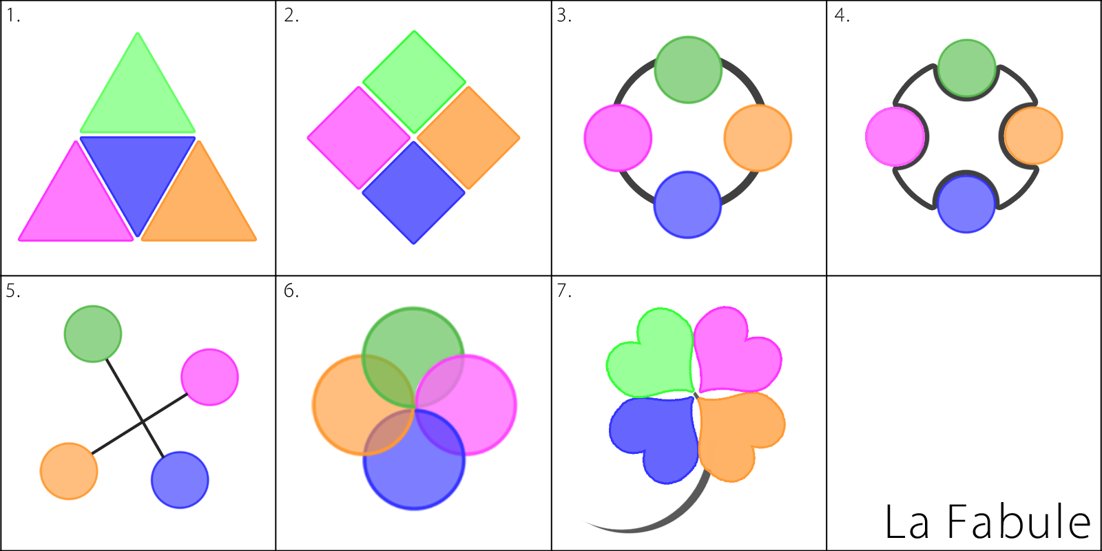
Rationale
I added some rationale to each design.
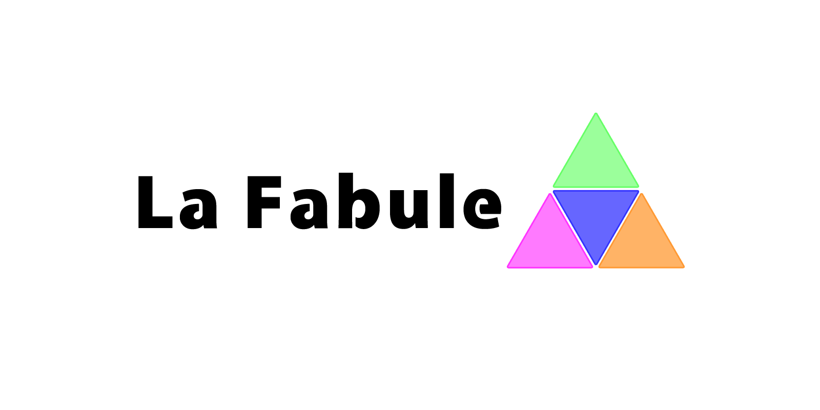
1. In this first alternative I chose to present the logo as a strong form, a triangle. I emphasized the strength also with a bold font weight. This version expresses a strong company with a team that cooperates with well defined and distinct roles, in a possible hierarchy structure with one dominant possible personality (green triangle on the top).
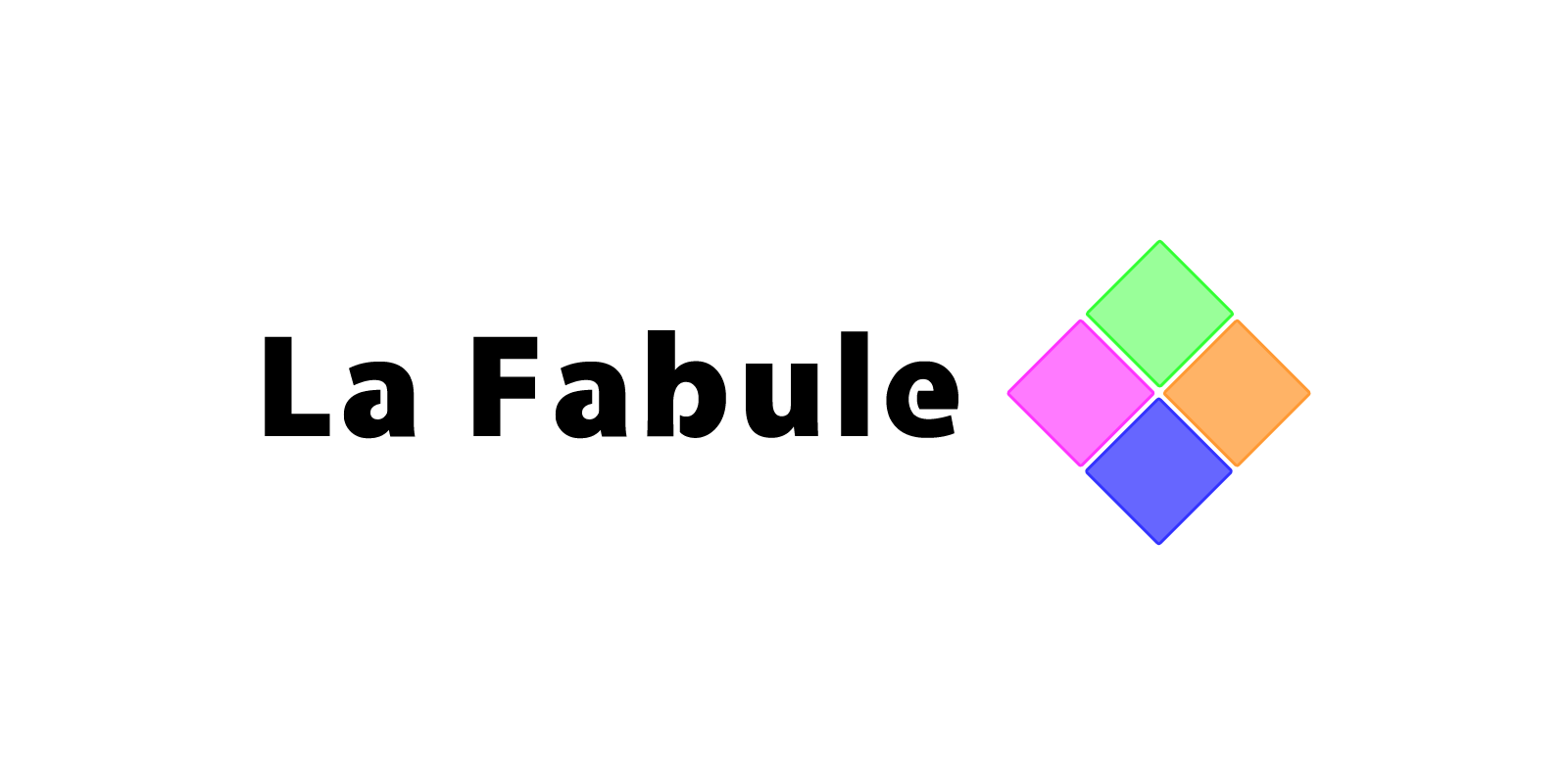
2. Following the previous style, I create this time a rhombus figure that expresses a strong company with solid and squared character. The collaboration between members looks very well defined and distinct functions.
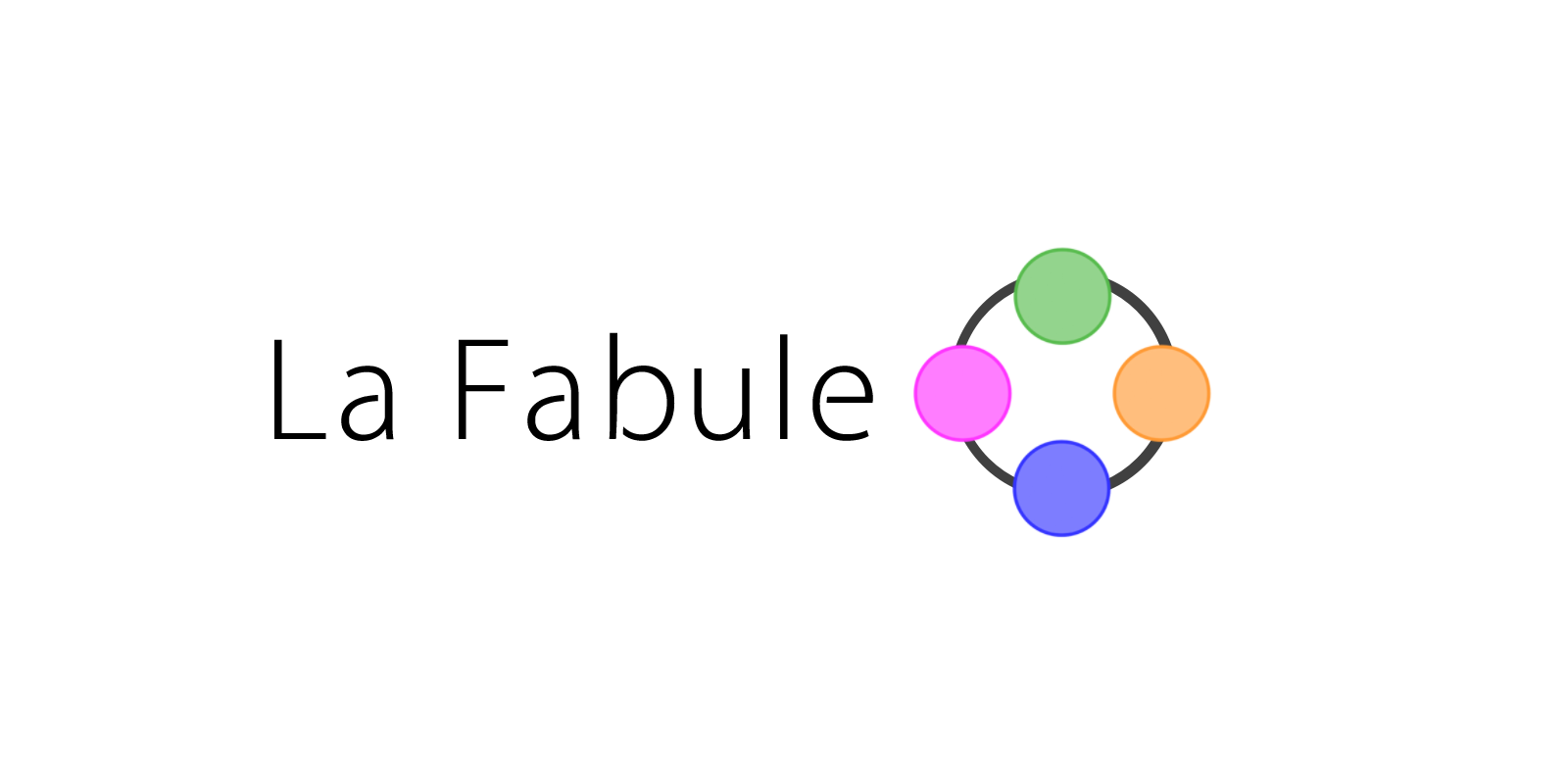
3. This third idea changes the prospective. The logo represents four people (stylized with four circles representing four heads seen from the top), which are holding their hands creating a circle. This concept emphasizes the cooperation. Members help each other.
4. This is a modification of the previous logo, where the four members are seated at a round table. This concept expresses the communication between members.
5. The fifth alternative is more artistic, it expresses the connection between four members, but with a bias towards one personality (the green circle) that could stands over the others.
6. This logo expresses the perfect cohesion between the members of the company, represented through the overlapping of the single personality.
7. The final version is the most artistic representation. The passion of the members, represented with the heart form of the petals of the quatrefoil, forms a symbol of good luck charm (the quatrefoil). The symbol recalls also the fable theme, therefore was an especially good design.