Francesco Busolini // portfolio
A Word is not Enough - WEB DESIGN
A Word is not Enough - WEB DESIGN
The redesign of the homepage of this website was a personal exercise for the Web Design course taken at the University of Udine. Everything started cause I felt challenged by the professor’s words “not for every content it could be possible create a good web design”.
He gave us as an example the "A Word is not Enough" website, saying that the content presented in the page doesn't give the opportunity to create an appealing layout. From this statement for me was natural to challenge myself to create a redesign of it. The aim of the website was to redesign the homepage of the website in a more appropriate and graceful way.
The original homepage of the website is presented in the following image (with some modifications, due to avoid an infringement of the brand copyright of the original website):
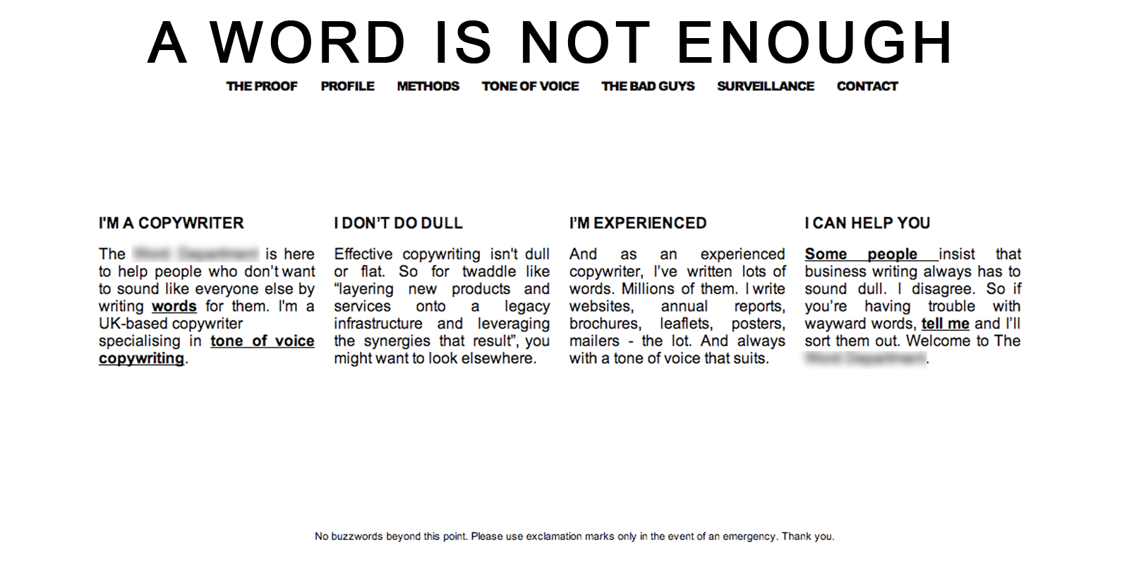
I used a different style. From the modern minimal black and white style, presented above, I moved to a more elegant design based on shades of grey, with red highlighted elements. I used border and lines to add more daintiness and I chose the Garamond font that gives more sophistication to the style of the page. On the wide screens the layout is based on three columns, one centred column for small screens. I chose to highlight the first column of the original layout (I’m a copywriter), giving a different background and full-width over the three columns.
The new version of the website is:
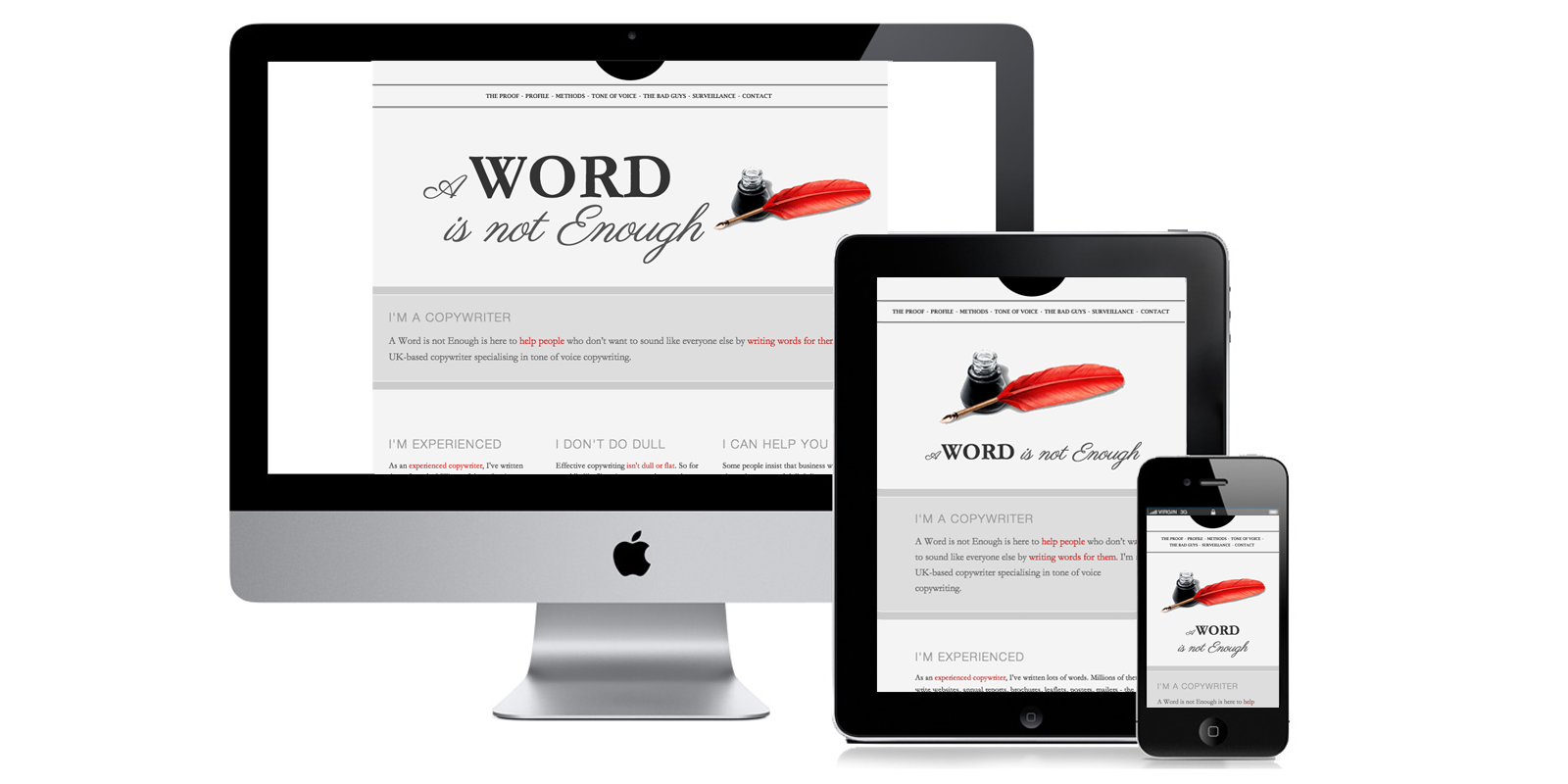
I implemented the website with HTML5, CSS. The website is responsive and perfectly visible on different devices.
The final result, with the live version of the website is visible at A Word is not Enough.