Francesco Busolini // portfolio
Toque Noir- LOGO DESIGN
Toque Noir - LOGO DESIGN
The logo comes up from the entrepreneurial idea of a young girl who want to open her business, inspired by homemade cuisine. Toque Noir, the name of the company, takes his name from the tipical chef hat, the Toque. To distinguish her business, she chose the black color to represent elegance and to be opposite to the traditional white colour of the chef's hat.
Based on this description I started to design a logo for her company. I sketched around the idea of the chef. I took the most remarkable elements that distinguish the chef: the hat and the moustache.

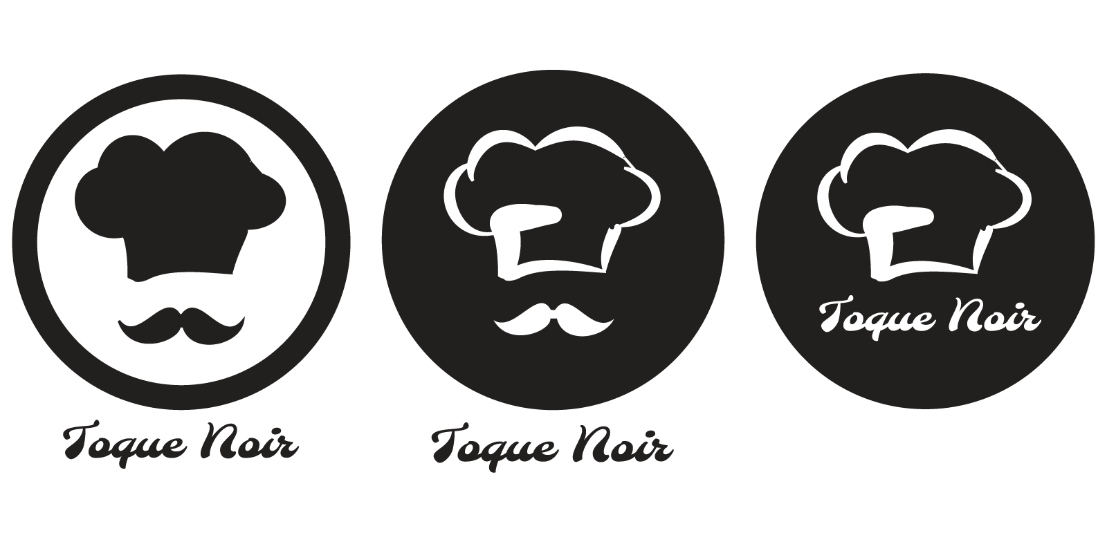
I started designing a simple black toque on a white background. I added black moustache and I inscribed these two elements inside a circle to delimitate the area of the logo. Finally, I added the name of the company under it. In the second version I tried to invert the colours in order to obtain a prevalence of the black colour. I left white only the moustache and the contour of the toque. This resulted in a very elegant black logo. Following this idea, I tried to simplify the logo by removing the moustache (which won't represent the female chefs) and move the name inside the circle. The logo was still understandable.

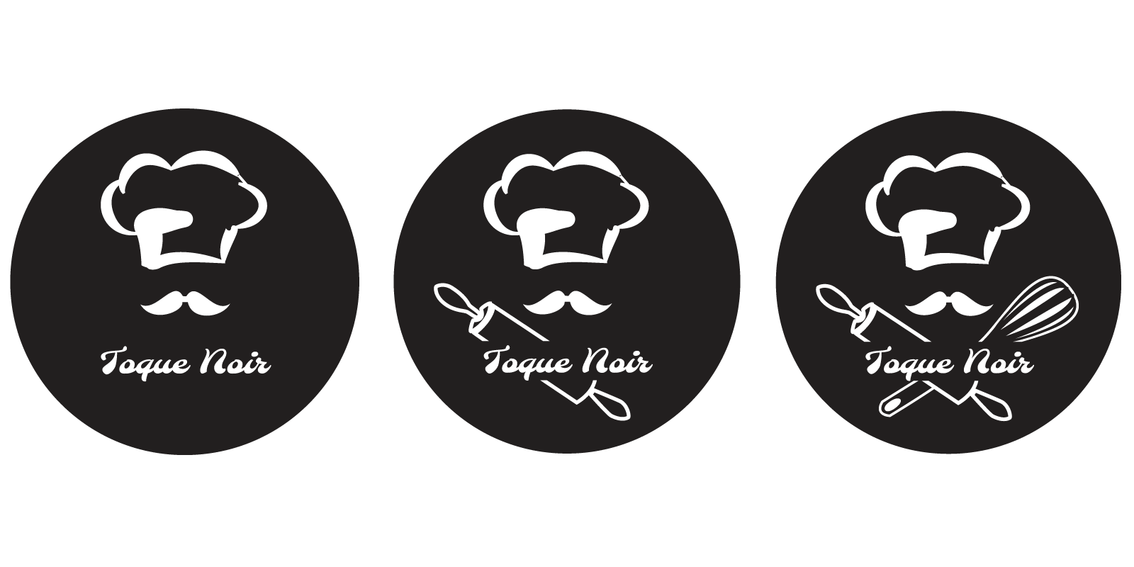
I followed then the inspiration to inscribe the name of the company inside the circle but maintaining also the chef's moustache. Since the size of the circle has increased, there was empty space on the sides of the logo. To try to fill this empty space with something, and make the logo more complete, I start to think of showing also tools that chefs usually use in cuisine. I discarded the typical fork, knife and spoon, since they are typically used for restoration but are used from the people who eat. Therefore I selected whisk and rolling pin to represent the household tools that are used traditionally to prepare homemade dishes.

The client was really happy of the outcome. The last logo with both tools resulted the best to the client, because more complete and eye-catching.