The Process Flow
The flow of the designing process didn’t follow a straight path. In the designing process specific stages are visible that include five main steps: the literature study; the expansion of the problem; the convergence toward a specific prototype; the user test that compares Alchemy and Cicero; and the final iterations aimed to improve the concept. The illustration shows the process flow with the stages along with the methodologies used.
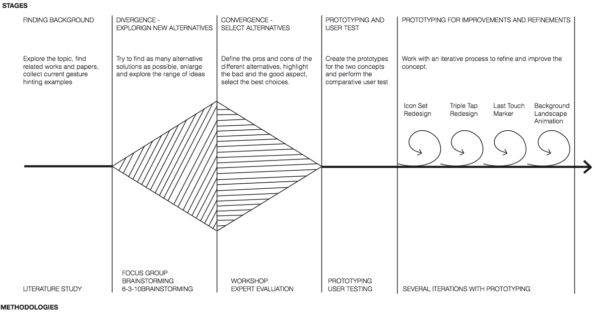
The process flow followed an almost ideal flow, but was also biased by the time and resources I had. In the first part of the work I had easy access to human resources. I had the opportunity to work with other colleagues that are studying interaction design and this helped me with the second and the third stage of the flow, where I explored the different possible alternatives for the gesture hinting system. I had also access to a discrete number of end users from different countries that I used to grasp the essential aspects of gesture hinting and for the user test. In the last stage I worked mostly alone, developing improvements and designing solutions based more on theoretical and logical choices, intuitions and discussions with Sus Lundgren – the author of Alchemy.
Divergent Phase
In this first stage I asked to users and colleagues to consider current solutions and express their opinions, I tried to explore and expand the topic, find as many solutions as possible and go as wild as possible. First I started with a Focus Group, the scope of this first session was to discuss the current solutions for gesture hinting available on mobile devices, highlight the important and problematic aspects of the topic and find some insights for new alternative techniques. It followed a Classic Brainstorming session, where the focus was to find some insights for new alternative techniques for gesture hinting and try to propose a general framework/solution, independent from the specific applications. Finally I ideate a method that combines 3-6-5 Brainstorming and C-Sketch. In this session I was interested to reveal new alternative solutions for dynamic gesture hinting, showing graphically where and how we can visually place symbols and when and for how long should they appear.
Focus Group
The scope of this first focus group session was to discuss the current solutions for gesture hinting available on mobile devices, highlight the important and problematic aspects of the topic and find some insights for new alternative techniques.
Method: Focus Group
Time: 60 minutes
Participants: 4 Students (20-25 years old)
During the session the participants tried to discuss around the following broad questions:
- How can we suggest to the users which gestures are available for an element of the mobile device's GUI?
- Which are the pro and cons of the current techniques? Which would you like to use for your gesture hinting solution?
- When should we show the gesture hints? And for how long?
In the second part of the focus group, I worked with an opposite focus group. I asked:
- How can you generate gesture ambiguity on mobile device's GUI?
- Which kind of hidden gestures did you find while you had used your mobile phone?
- Which kind of functionalities, that you would like to design or that you found in some apps, requires a non-obvious gesture interaction?
RESULTS
The comments received during the focus group highlighted the following main argumentations:
- Animations and Hints are better than Written Instructions, Videos and Tutorials�
- Users like the Magic Effect of gestures exploring and finding new gestures or interactions themselves�
- This suggested that seeing hints should perhaps be a user-driven setting or mode�
Classic Brainstorming
The focus of this brainstorming session was to find some insights for new alternative techniques for gesture hinting and try to propose a general framework/solution, independent from the specific applications.
Method: Brainstorming
Time: 45 minutes
Participants: 4 Interaction Design Master Students (20-25 years old)
During the session the participants tried to discuss around the following general questions:
- Mobile gesture interfaces lacks of ways of communicating how to interact with them. How can we suggest to the users which gestures are available for an element of the mobile device's graphical user interfaces?
- How can we provide information on what gesture can be used in a general way, independent from the specific applications?
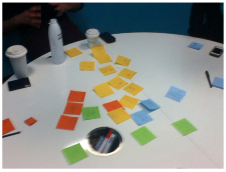
A picture from the Brainstorming session. Each participant received some Post-its of different colors. The participants had 5 minutes for write their first ideas, without talk to each others. After this step they have other 40 minutes to compare their ideas and build new solutions upon them.
RESULTS
The participants produced four main categories of ideas:
- animations close to the finger;
- small subtle visual clues;�
- contextual menu around the finger;
- icons placed in one overlay layer that appears on user's request.
3-6-5 Brainstorming and C-Sketch
The focus of this brainstorming session was to find some new alternative solutions for dynamic gesture hinting, showing where and how we can visually place symbols and when and for how long should they appear.
Method: 3-6-5 Brainstorming
C-SketchTime: 60 minutes
Participants: 6 Interaction Design Master Students (20-25 years old)
During the session the participants tried to sketch some solutions for the following questions:
- How can we show symbols in dynamic gesture hinting?
- Where and when should we show them?
- When should they disappear?
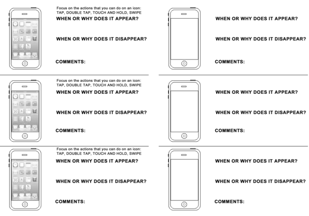
Scenarios used during the 3-6-5 Brainstoring with C-Sketch session. Each of the 6 participant received three papers, with and without scenarios, that drive them to sketch on 3 ideas for 10 minutes. The participant could draw a sketch (to show where and how displaying symbols) and a section where they could write when the visualization appears and when it disappears (from which we can also estimate the duration). Then everyone gave his papers to the next participant for the next turn. 108 ideas were generated.
RESULTS
HOW?
- Show available gestures directly
- Use an explorative mode
WHERE?
- Contextual menu
- Semitransparent overlay
- Icons around the finger
- Icons in a fixed place
- Animations
WHEN?
Each solution suggested a different time slot required to best suite the specific implementation.
The result of the divergent phase was a number of different alternatives that could be used for designing a new concept for gesture hinting. The more promising of these alternatives are presented in the next figure.
Convergent Phase
Once I get many alternatives I needed to reduce their number and select the best solutions. For this reason I ideate a new method for the Workshop to highlight more pros and cons for each alternative, that doesn’t ask directly to the participants to elicit wich pros and cons they find for each alternative, but through the discussion between them, shows in a more natural way which aspects are critical and which solutions are more promising. Based on these results I designed some possible flows that I thought were the best solutions; since I’d like to have more feedback on my work and I didn’t want to choose a solution based only on my opinion I planned an Expert Evaluation. Due to the short time available with expert evaluators; I should adapt the method to best suit my conditions. I designed the Expert Evaluation based on the number of experts and the number of flows that I have to evaluate. Since these were six and I had only thirty minutes to perform the method, because this was inserted in a workshop session with other teams and projects, I ideated a strategy to make all the evaluators work simultaneously on a different flow and then switch the flows with their neighbour in order to have all the six flows evaluated from each expert. This method worked really well and I could collect a lot of feedback and suggestions. The evaluations helped me with the final deep analysis on all the possible alternatives and made easier for me to take decisions for the final alternative concept. In this stage was really important the feedback received from other colleagues and experts, which gave me many different points of view on the solutions, highlighting good and bad aspects that I couldn’t see at the beginning, or confirming my expectations – four eyes are always better than two.
Draw the Flows: Workshop
The aim of this workshop was to deeper explore the alternatives obtained during the divergent phase, and find pros and cons of the different solutions.
Method: Workshop
Time: 40 minutes
Participants: 2 Groups of
4 Students (20-25 years old)The participant were asked to draw three possible flows that they would like to see in their gesture hinting system. This forced the participants to arguing to each other and arguing for pros and cons of each alternative.
For this method I used a whiteboard, many stickers with different colors and markers. In this session the whiteboard was divided horizontally in two - explorative mode and direct manipulation - and vertically in 4/5 areas, which included 3/4 steps of the flow (depending on which method is used: direct manipulation or explorative mode) and final comments with a list of pros and cons.
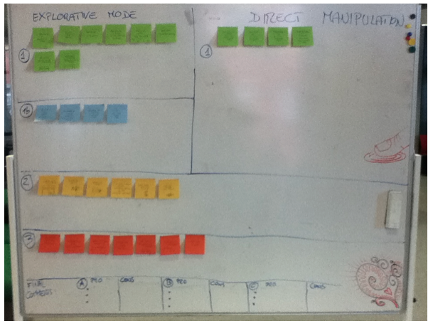
A picture from the Draw the Flow Workshop. 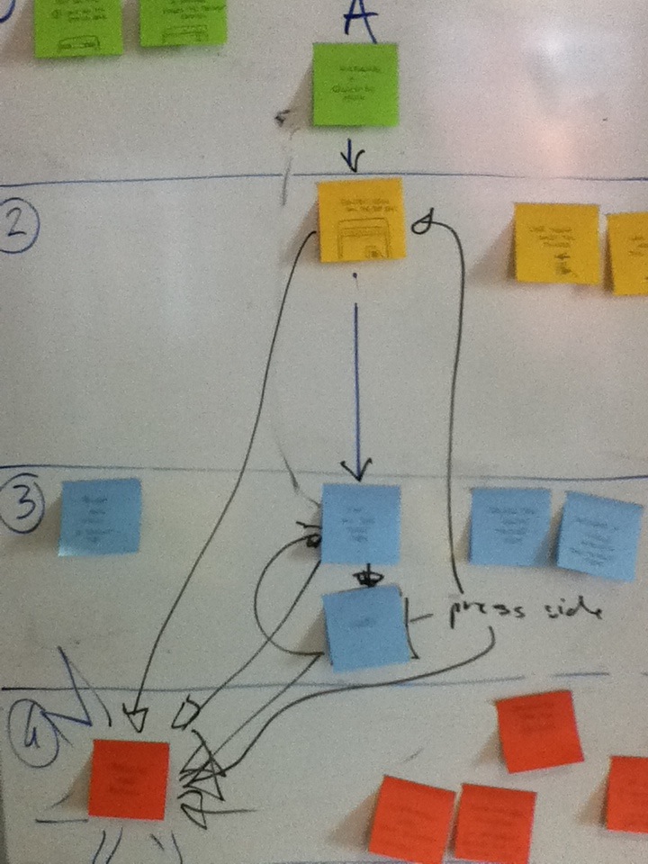
A picture from the Draw the Flow Workshop. 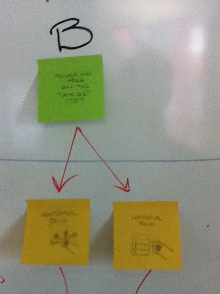
A picture from the Draw the Flow Workshop. 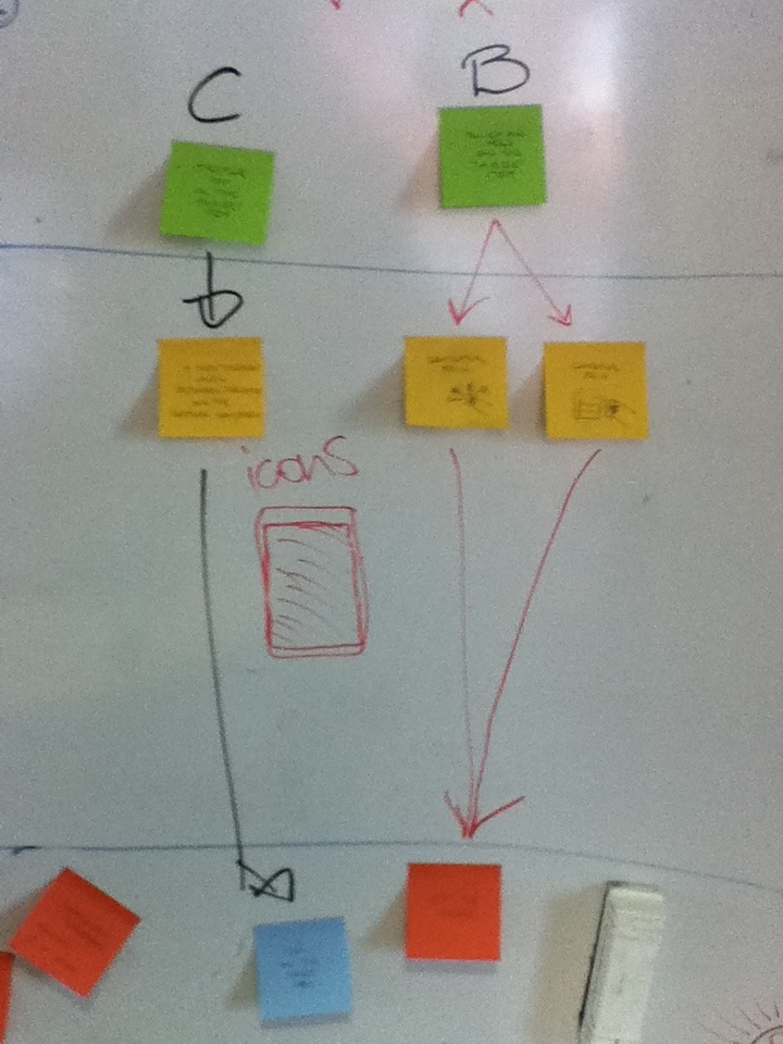
A picture from the Draw the Flow Workshop. 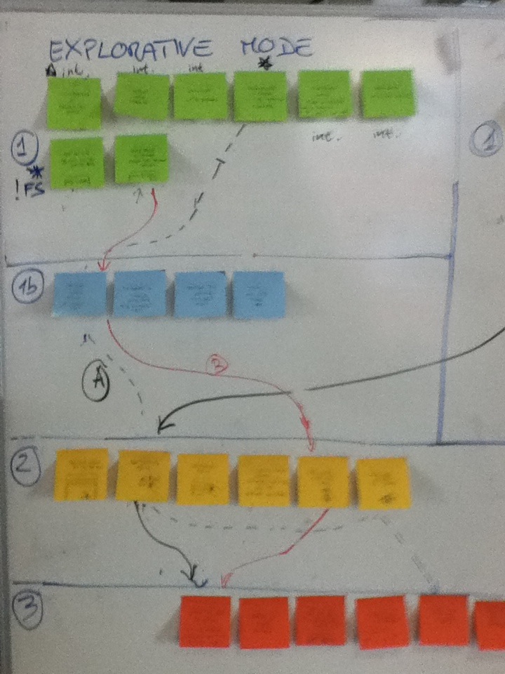
A picture from the Draw the Flow Workshop. RESULTS
From these two sessions I found many good observations and critiques on the different alternatives. I collected those pros and cons and I used them to analyse and design some good flows, highlighting the advantages and disadvantages of each of them.
Designing the Flows
The results of the workshop gave me more pros and cons and I used them to analyse and design some good flows, highlighting the advantages and disadvantages of each of them.
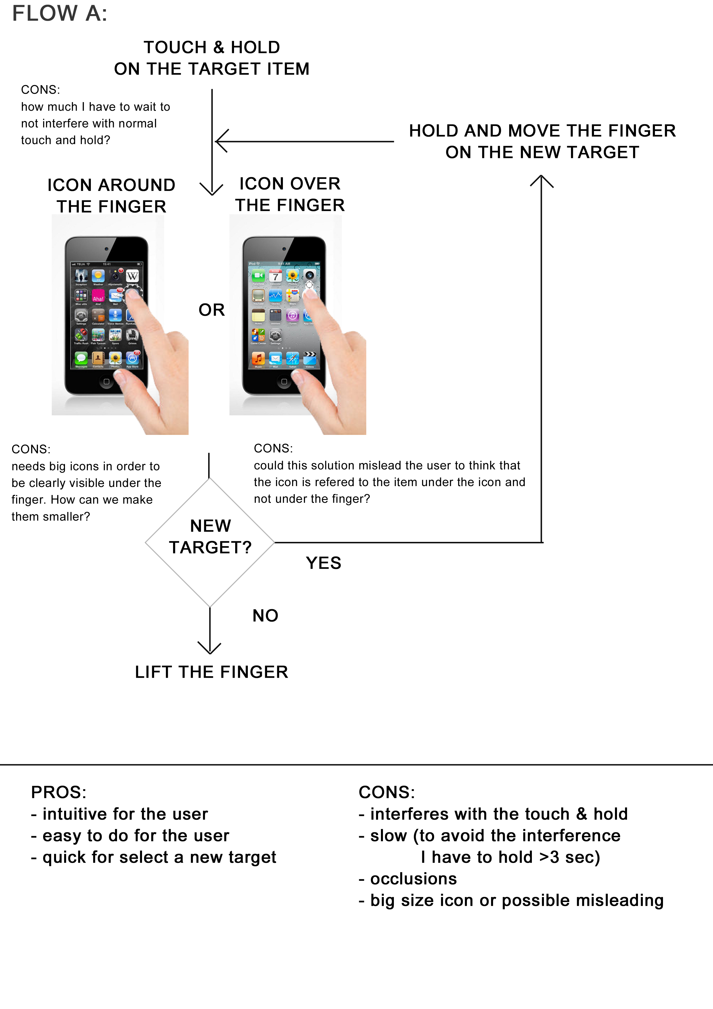
The Flow A designed on the basis of analysis and comments received in the previous stages for the different alternative solutions. 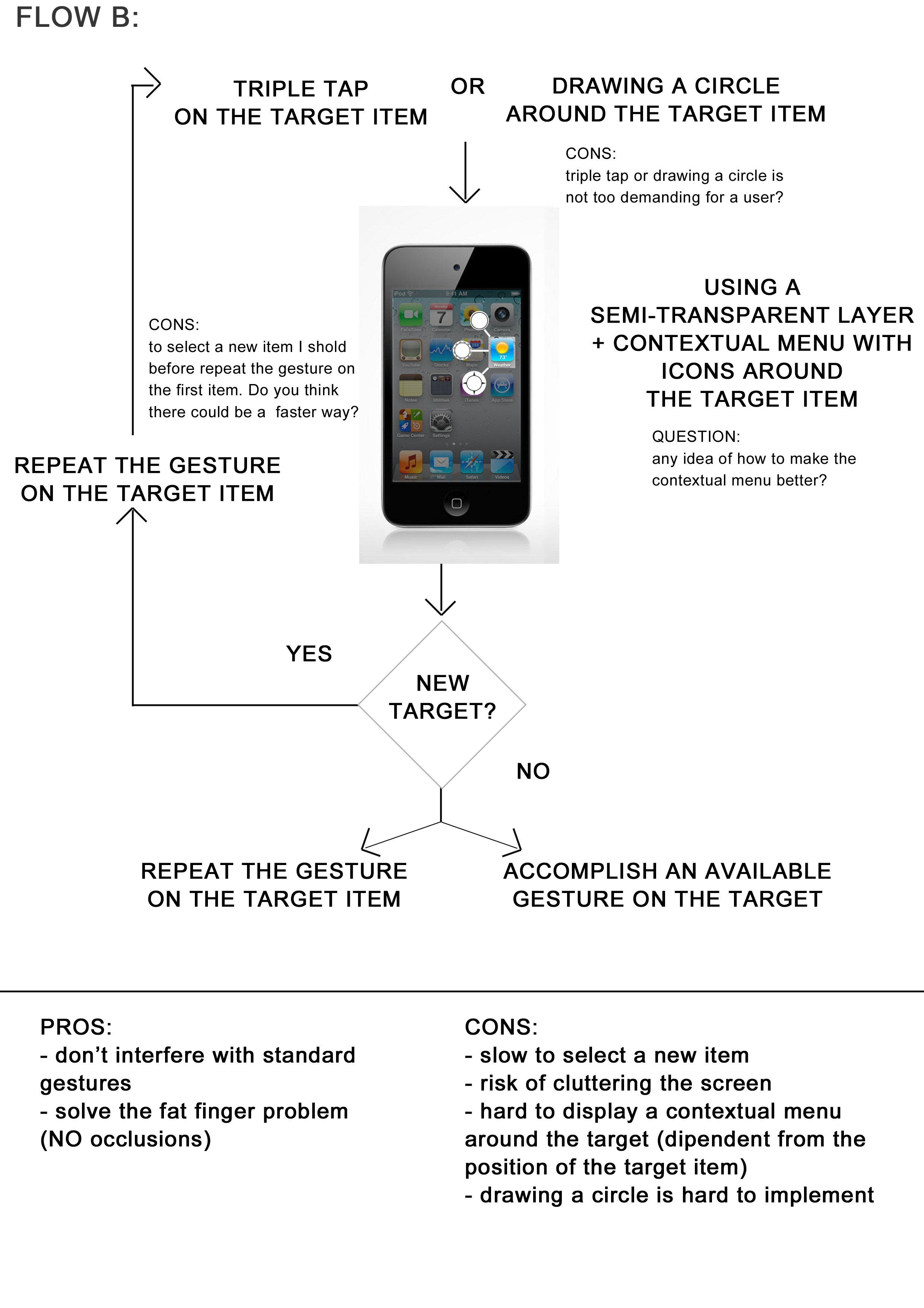
The Flow B designed on the basis of analysis and comments received in the previous stages for the different alternative solutions. 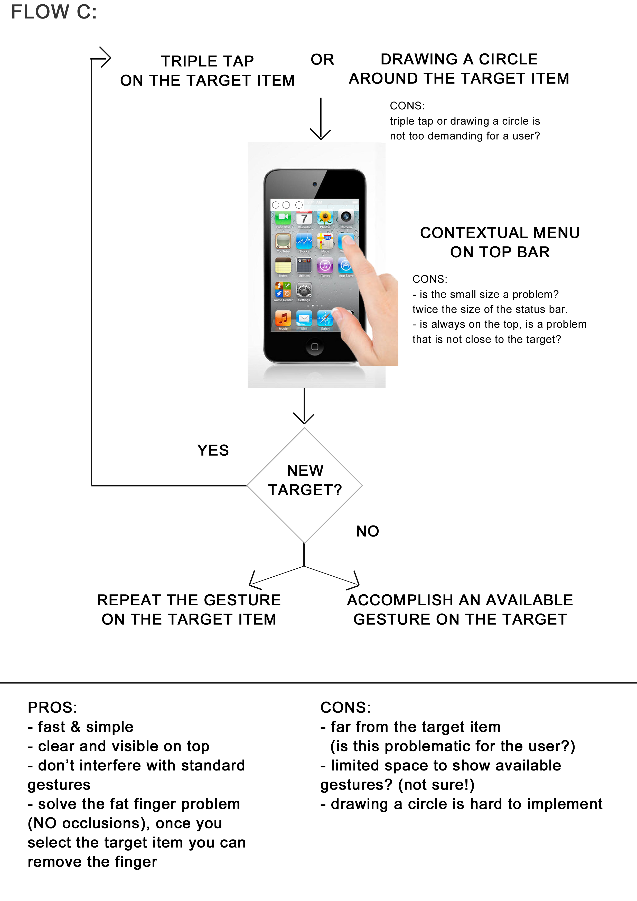
The Flow C designed on the basis of analysis and comments received in the previous stages for the different alternative solutions. 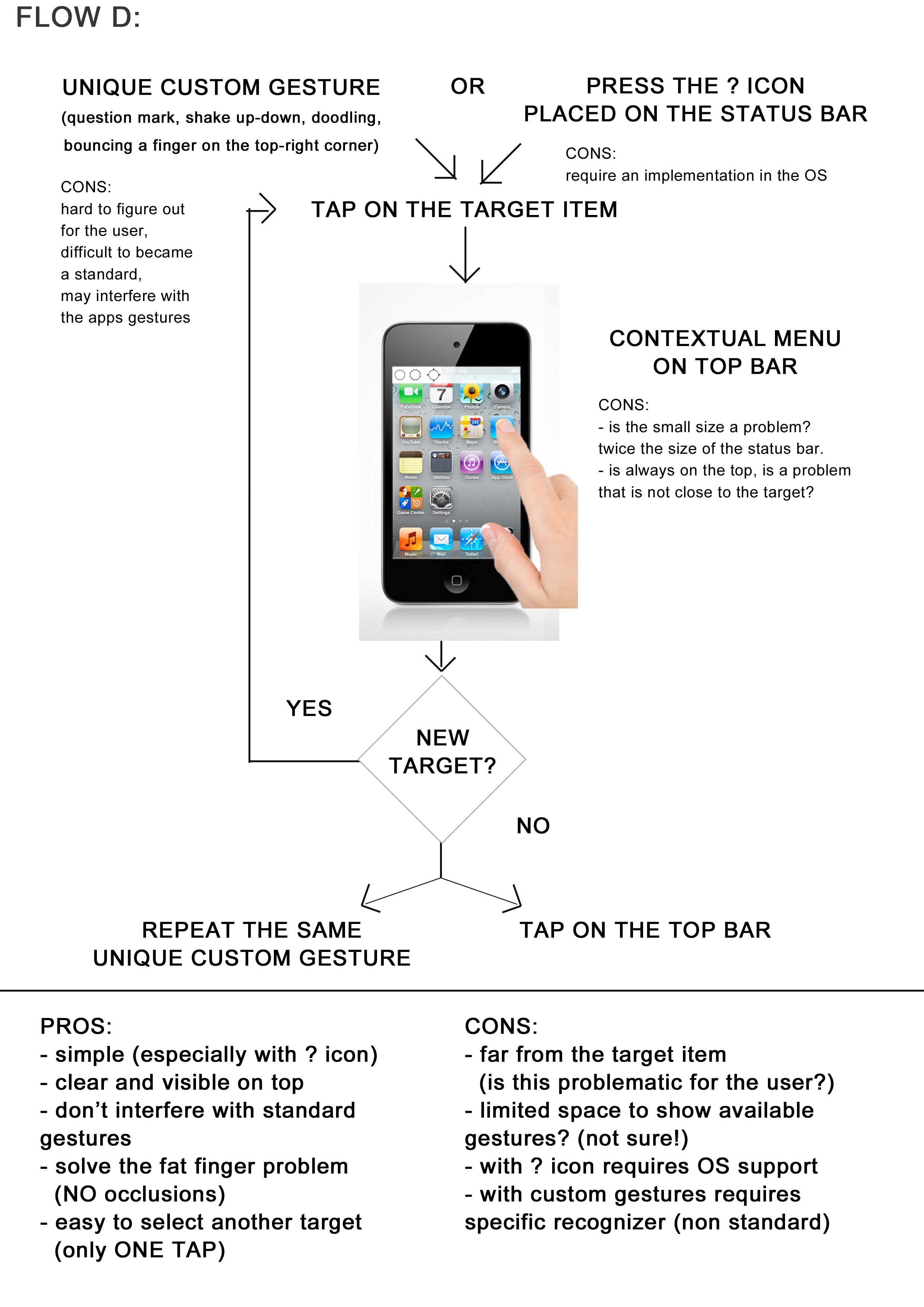
The Flow D designed on the basis of analysis and comments received in the previous stages for the different alternative solutions. 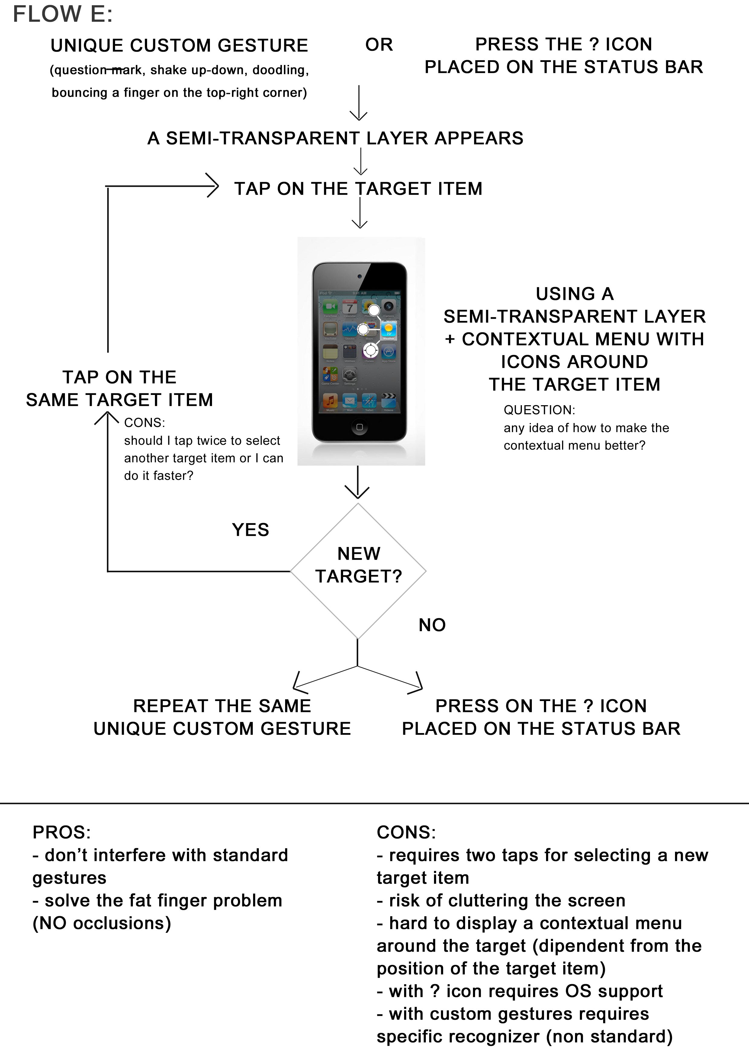
The Flow E designed on the basis of analysis and comments received in the previous stages for the different alternative solutions. 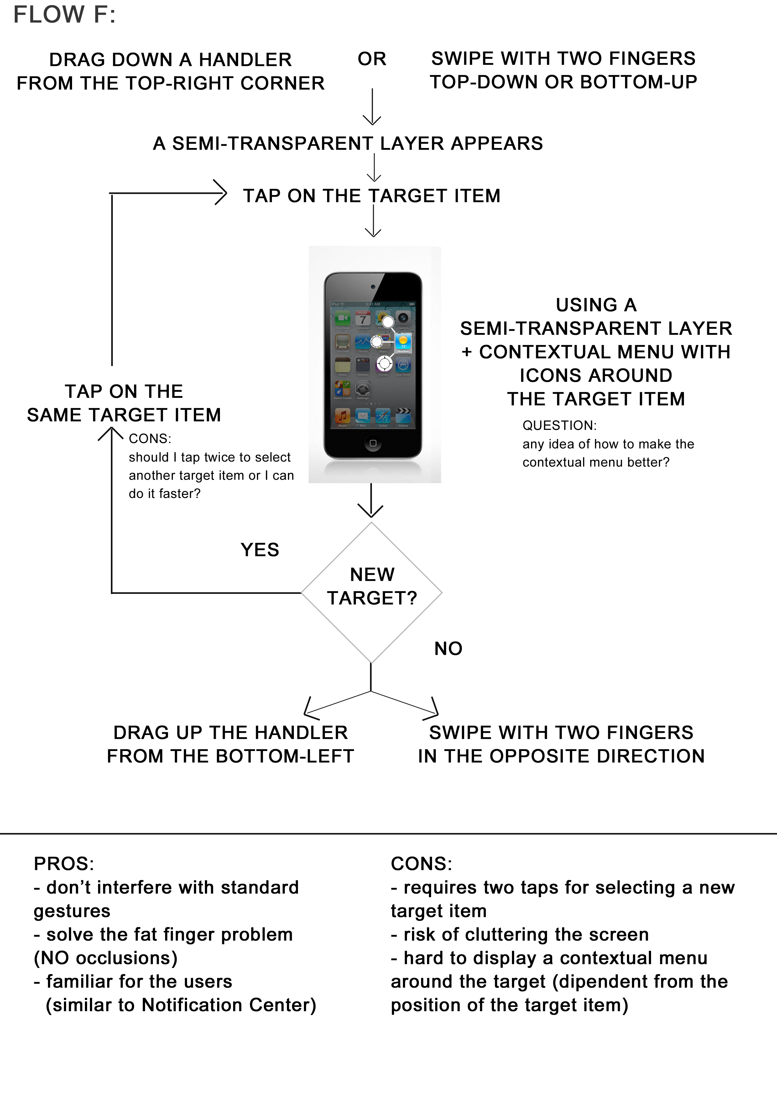
The Flow F designed on the basis of analysis and comments received in the previous stages for the different alternative solutions. Judge the Flows: Expert Evaluation
On the six best designed flows, I run this evaluation session. The aim of this session was to let expert evaluators judge the different flows and find possible problems and/or solutions. This in order to help me to judge in a more objective way the flows, and to rise other pros and cons that I can have missed before.
Method: Expert Evaluation
Time: 35 minutes
Participants: 5 Interaction Design Master Students (25-28 years old)
2 Interaction Design ProfessorsThe participants received an introduction to the problem and the problem statement:
I prepared 6 flows. Each flow combines different steps. Each step has pros and cons. Therefore also each flow has pros and cons. What I want from you is to add positive comments or new pros with the green Post-it, suggestions or new ideas with the yellow Post-it, and negative comments or cons with the red Post-it.
The participants were invited to add post-it with positive feedback, pros, suggestions, new ideas, negative feedback, or cons. I gave one flow to each participant; they had 5 minutes for adding the post-its then they should give the flow to the next participant on their left. After 6 turns the task ended. At the end I asked the participants to highlight the solutions that they considered the most or the less promising.
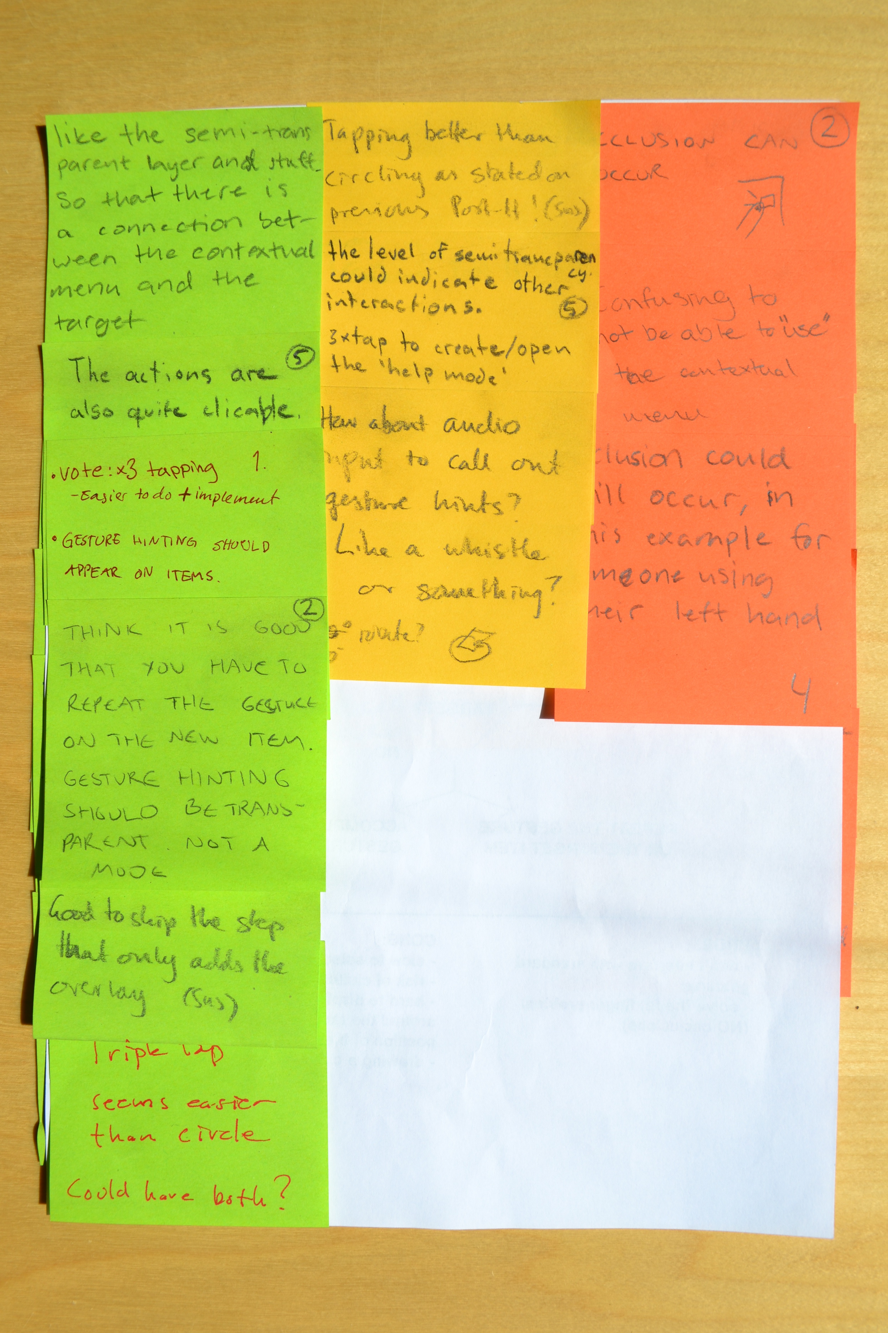
An example of feedback received for the Flows. RESULTS
The main results obtained from this session were:
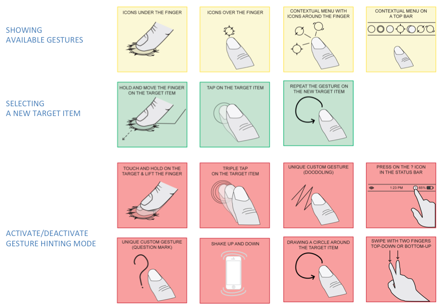
- Activation: triple tap on the target item, the swipe with two fingers, touch and hold on the target item and the "?" icon on the status bar.
- Showing the Icons: the contextual menu on the top bar or with icons around the target.
- Selection: tap or drag.
As a result of the convergent phase I got a lot of feedback (positive feedback, alternative solutions and suggestions, negative feedback that helped me to exclude some of the alternatives). I deeply analysed all the collected material and I evaluated every solution proposed. In the next table are presented the outcomes of the convergent phase, whit pros and cons for each of the considered alternatives.
Pros & Cons of Activating solutions
Pros & Cons of Activating solutions Activating the Mode Pros Cons Touch and hold on the target and lift the finger - fast
- easy
- less steps- interferes
- occlusionsTriple tap on the target - fast
- easy
- doesn’t interfere
- no occlusions
- easy to remember- need to be learned
- hard for elderDrawing a circle around the target - unique
- no occlusions- interferes
- bad for overall gestures
- need to be learned
- hard with items closed to the edge
- hard to accomplish correctlyUnique custom gesture - unique
- customizable
- no occlusions- need to be learned
- may interfere
- hard to implement
- hard to find natural custom gesturesPress on the "?" icon in the top bar - common
- easy
- no occlusions- may interfere
- may break a OS's standardSwipe with two fingers top-down or bottom-up & swipe in the opposite direction - fast
- easy
- no occlusions- may interfere Accomplish an available gesture on the target - fast
- easy to remember- hard to implement
- shouldn’t be the only way to closeTap on the top bar - fast
- easy
- no occlusions
- always visible- require to show the bar Pros & Cons of Showing Hints solutions
Pros & Cons of Showing Hints solutions Show Gesture Hints Pros Cons Icons around the finger - close to the target - occlusions
- less visible, less clear
- requires composite iconsIcons over the finger - close to the target - occlusions
- small
- less visible
- requires composite iconsContextual menu with icons around the finger - close to the target
- no-composite icons- hard to display without occlusions
- more space required
- inconsistent behaviourContextual menu on the top bar - no occlusions
- can be tap-able
- no-composite icons- far from the target item
- small with many iconsPros & Cons of Selectings Targets solutions
Pros & Cons of Selectings Targets solutions Selecting a New Target Pros Cons Hold and move the finger on the target - fast
- easy
- immediate- occlusions
- requires touch and hold activationRepeat the gesture on the target - slow
- demanding for the user
- requires two stepsTap on the target - fast
- easy
- immediate
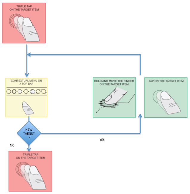
At the end of the convergent phase I got a flow that best integrate the best alternative solutions outcome from the discussion and evaluations. The flow for the new concept was ready. The gesture hinting mode starts when the user accomplish a triple tap on the screen. The activation of the mode reveal a top bar that contain a contextual menu with all the gestue hinting icons. The user can select a target by tapping or moving his finger onto it. To switch back to the working mode the user triple taps again. The resulting flow is presented in the following illustration.
Prototyping
To compare Alchemy and Cicero I planned to make a user test to see the difference between the two approaches in terms of effectiveness, efficiency and satisfaction. Therefore I had to design and implement two prototypes used during the user testing. I chose to implement high-fidelity prototypes because I needed to test the approach and not only the graphical interface. The user testing was focused on the visualization of the information on the interface, but also on the interaction of the user with the system. A low- fidelity prototype – like pen and paper prototypes or wizard of Oz method combined with possible templates – breaks the flow of the interaction, and it would not allow me to measure how fast the system reacts to the user’s interaction or how the user behaves with the system hints. For these reasons I decided to implement a high-fidelity prototype that could mimic directly the functionalities of the gesture hinting system, could look and behave like a final product.
For Alchemy I chose to implement the following flow, based on the original article that describes it, and the comments received by the author Sus Lundgren. The gesture hinting is revealed with a touch and hold gesture, under the finger of the user it appears an (combined) icon that shows the available gesture(s) for the target item. The user can move his finger around the screen, over a new target item, and the icon will change accordingly with the available gestures of the new object. The gesture hinting disappears when the user lift the finger.
This video shows the interaction of a prticipant with Alchemy during the user test.
Cicero features a triple tap to activate the gesture hinting mode. This reveals the top bar, showing the relevant hint icons. The user can select a target by tapping it, or moving his finger onto it; the icons of available gesture are then highlighted. To leave the gesture hinting mode the user triple taps again.
This video shows the interaction of a prticipant with Alchemy during the user test.
For the user testing, I implemented both the concepts for the iOS platform, using the SDK 6 for iOS on Xcode version 4.6.2. Xcode is the Apple’s integrated developing environment (IDE) that contains the suite of software development tools for developing software for OS X and iOS. I compiled and test the code on an iPod Touch 4th generation, with a display 3.5” inches and a resolution of 960x640 with 326 ppi (pixel per inch). The same device was used also during the user testing.
Both the prototypes were created on the basis of the same scenario used for the user testing. The scenario included ten white screens with three objects each, where the user has to discover which gestures were available for each object. I chose to show two screens with one available gesture, two screens with two available gestures, two screens with three available gestures, two screens with four or five available gestures, and two screens with six or seven available gestures. To choose properly a good set of available gesture combinations I selected some examples from the current apps available for mobile devices.
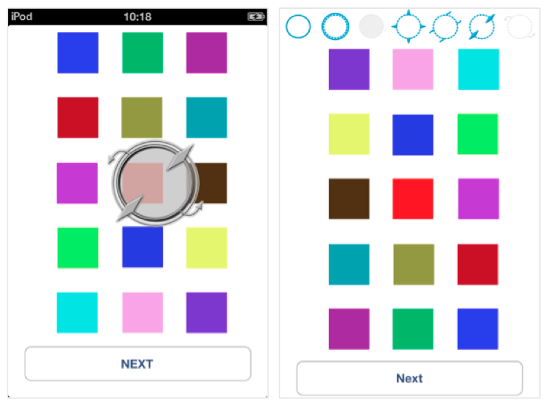
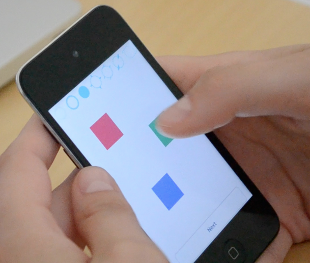
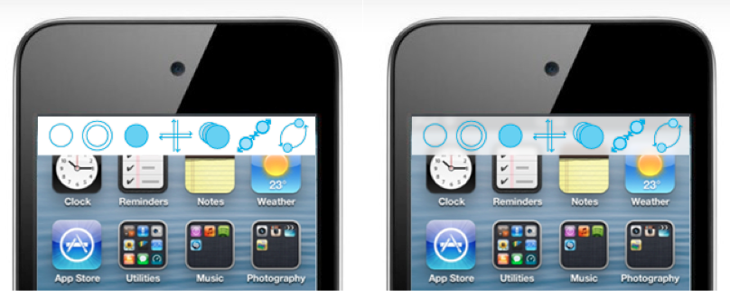
I also coded two prototypes for the training session for the users. They had to train with both the approaches for 5 minutes before they started the user testing. These sessions were organized with two screens, presented in the figure above, that showed 15 square coloured target items each on a white background. To switch between the two screens the users had to tap on the “next” button, they did the same during the user testing to change the screen. Training with many icons on one screen help the users also to be precise and more confident later during the user testing.
User Test
With this user test I compared the Alchemy and the Cicero approaches in order to understand which of them is more suitable for further developments. The study was a counterbalanced within-subjects study, combining quantitative and qualitative methods.
To measure effectiveness, the number of errors was collected.
To measure efficiency task completion times were collected.
To measure satisfaction, two questionnaires were used: one regarding expectations; the second regarding experience, as used in the SUXES method.
The aim was to make a formative test, which was to form a basis for an improved design of the better concept. The aim was thus to assess the following:
- The overall effectiveness and efficiency of the gesture hinting in each concept respectively, having users perform basic tasks.
- The overall satisfaction elicited from the use of the two different concepts, respectively.
- Whether there were any difficulties related to understanding the available gestures of a target item.
Participants
Twelve participants took part in the user test. Of these, six were male, six female. Four did not own a touch screen device and were not familiar with touch screen interaction; they are seen as beginners in this study. The remaining eight are seen as experts, since they all owned a touch screen device and were experienced in interacting with it. The participants were between 20 and 30 years old (avg. age = 23.4 years) and between them, they represented eight different European countries (Italy, Sweden, Germany, Poland, Turkey, Greece, Spain, France).
| Characteristics | Number |
|---|---|
| Experience with touch screen mobile devices | |
| expert users | 8 |
| beginner users | 4 |
| Age | |
| 20-30 | 12 |
| Gender | |
| Male | 6 |
| Female | 6 |
Test Procedure
This usability study gathered assessment data about the effectiveness and efficiency of the two approaches. Participants were divided in two groups, to avoid biasing I used a within-subject user test. I collected data about time spent, error and success rates as well as qualitative data about participants’ experiences using the two approaches.
In this within-subjects study, each participant tried all the 10 mini-tasks with both approaches, in counterbalanced order. I conducted up to 12 individual 40-minute usability study sessions. Each participant performed all the 10 mini-tasks with both approaches. I used 20 minutes of each session to explain the session to the participant, review the basic background information with the participant, fill the questionnaire about expectations and experience, and then conduct a debriefing interview. During the middle 20 minutes of the session, participants worked to discover which gestures are available for the target items in each mini-task. At the end the participants filled out a questionnaire to evaluate their satisfaction and I conducted a post-test debriefing.
For this user test I used 10 mini-tasks to compare the effectiveness and efficiency of the two approaches in terms of errors and time spent. While for the satisfaction I used two questionnaires, the first collects data about the ex- pectations and the second about the experience. This method is used in the SUXES method (Turunen et al. 2009, Turunen et al. 2009) for measuring user expectations and experiences. I took some inspirations for the debriefing interview from the Interview Questions of Williamson, who explore the user experience and acceptance of multimodal interfaces.
The user test was carried out in five steps.
Introduction
The introduction to the user test requires 10 minutes and concerned the following activities:
- Review and sign nondisclosures and recording permissions.
- Fill out a background questionnaire (name, gender, age, experience).
- Participant's experience with usability studies and focus groups.
- Importance of their involvement in the study.
- Moderator's role.
- Room configuration, recording systems of the screen, observers, etc.
- The protocol for the rest of the session.
- Presentation of the icons set and associated gestures.
- Presentation of the two different approaches.
SUXES Questionnaire - Expectations
Thereafter, the participants answered the first questionnaire regarding their expectation regard the speed, intuitiveness, ease of use, understandability, learnability and pleasantness of the two concepts. This was done by rating each of these properties on a 7 Likert scale twice – once for accepted level, once for desired level.
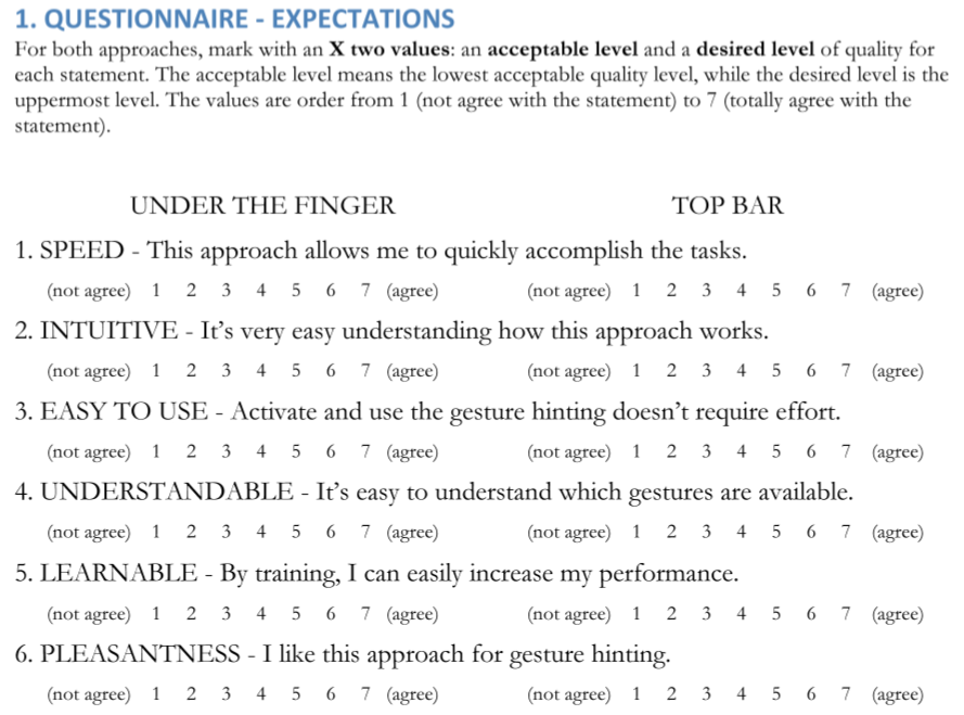
This was the SUXES questionnnaire delivered to the users to measure the users' expactations. Training & Testing
The next step was a five-minute training session for one of the concepts, followed by the actual test, when participants carried out the tasks. This part took ca. five minutes. During the test, the participants were not allowed to communicate with the moderator, who was present in order to record their answers to the tasks. The test session was also video recorded in order to ensure that all answers were recorded correctly, and to get a detailed record of users’ interaction, if needed.
Participants were divided in two groups, each with 4 expert and 2 beginner users. The first group performed the tasks with the approach A and then B; the second group performed the tasks with the approach B and then A. For each approach the participants were trained for 5 minutes, and then they had 5 minutes to accomplish the 10 mini-tasks with that approach.
Group A Training A, Task A, Training B, Task B Group B Training B, Task B, Training A, Task A Each mini-task required to the participant to activate the gesture hinting, understand and say to the moderator which gestures are available on the three target items displayed on the screen, and press the button to go to the next mini-task. When the participant has activated the gesture hinting (with the touch and hold – for the approach A – or with triple tap – for the approach B) a timer starts. The timer stopped when the participant accomplished the task and pressed on the button for moving to the next mini-task. In this way I could measure in a precise way the time spent by the users to accomplish each mini-task. This time doesn’t con- sider the time spent for activate the gesture hinting – which could be calculated in a more accurate way in a separate test.
The number of available gestures presented for each target varied with the mini-task according with the following list:
- 2 mini-tasks will show 1 available gesture per target item;
- 2 mini-tasks will show 2 available gestures per target item;
- 2 mini-tasks will show 3 available gestures per target item;
- 2 mini-tasks will show 4-5 available gestures per target item;
- 2 mini-tasks will show 6-7 available gestures per target item.
For each mini task, the number of errors and omissions were recorded. Stating the wrong name for a hint was considered an error, whereas an omission was when a user didn't notice a hint. The task completion time (in ms) was measured, starting when the gesture hinting was activated and ending when the participant pressed a next-button to move on to the next task.
The comparison between Alchemy an Cicero while the same user is accomplishing the final tasks (when the available gestures were more than four).
SUXES Questionnaire - Experience
Here, the participants completed a questionnaire to evaluate their satisfaction regarding the two concepts, again rating speed, intuitiveness, ease of use, understandability, learnability and pleasantness on a 7 Likert scale.
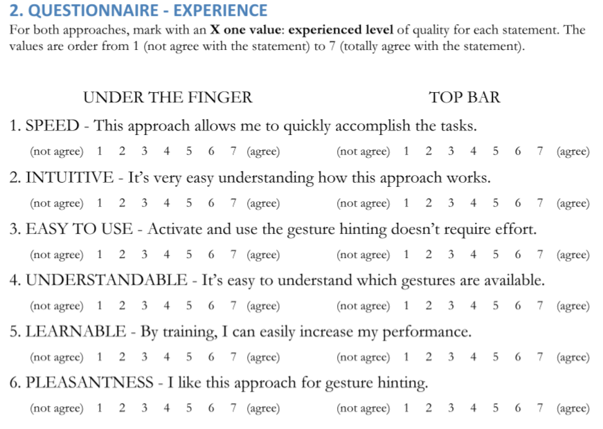
This was the SUXES questionnnaire delivered to the users to measure the users' experience. Debriefing Interview
The session was concluded with a post-test debriefing interview where I asked to participants some questions to deeply grasp their experience. I got a chance also to ask explanatoins for behaviours adopted in the testing phase.
Results of the User Test
The user testing revealed that the Cicero solution is more effective and efficient than Alchemy. The results indicate that users are faster and make fewer errors and omissions with Cicero, which seems to be very clear, easy to read and require very little cognitive effort. Also the satisfaction of the users shows that besides the expectations that are similar for both the approaches, the Cicero solution received extremely good experience evaluations. The users perceived the interaction with Cicero aligned with the desired values or even over them.
Effectiveness
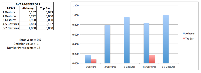
If we look at the effectiveness of the two approaches: the results for the number of errors and omissions committed by the participants during the 10 mini-tasks shows that the Cicero approach has just 2 errors and 2 omissions, while the Alchemy approach has 48 errors and 19 omissions. These results seem to show that with Alchemy approach the users make a lot of errors, but during the 10 mini-tasks 100 individual icons (combined in 30 icons in the under the finger approach) were shown. This means that, if we compare the number of error and omissions for the each singular icon, the average value for the errors is 4% for Alchemy and 0,16% for the Cicero; and the average value for the omissions is 1,58% for Alchemy and 0,16% for Cicero.
Efficiency
Cicero has better results than Alchemy. The time spent with Alchemy is always higher than the time spent with Cicero. The curves of the time spent with the two approaches show that the time spent with both approaches increases with the number of gestures shown for each target item, as expected from the hypothesis. However with the Cicero approach in the last two tasks (6-7 gestures at the same time) the time decreased rapidly.
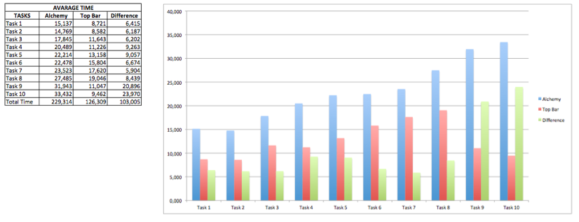
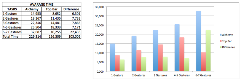
As we can see from the charts the difference between the Alchemy and the Cicero approaches is constant (except for the 6-7 gestures) and is around 7 seconds. This shows that no matter how many icons are shown, the Cicero solution is more efficient than Alchemy. We can also notice that, for the hard tasks 6-7 gestures, the time spent with Cicero it's less than one third (32,687 vs. 10,255 seconds) of the one with Alchemy. Also the mean total time spent for the 10 mini-tasks shows a considerable difference between the two approaches (3'40''314 vs. 2'6''309 with a difference of 1'43''005), quite double time.
Satisfaction
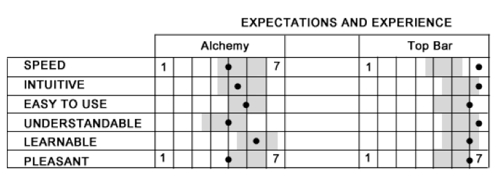
The expectations for the users are similar for both approaches. However, Cicero obtained better values than Alchemy for the experience evaluation. The Alchemy curve of experience is quite in the middle between the acceptable and the desired curves of expectations, this means that Alchemy meets the minimum expectations of the users, but doesn't come close to the desirable values. The Cicero curve of experience is almost always over the desirable curve of expectations. The only exception is for the "learnable" value that is just under the curve. The Cicero experienced curve is always in a range of 0.7 and 2.5 points over the Alchemy experienced curve. This shows how the satisfaction of the users is greater for the Cicero approach.
Discussion of the Results
The user testing revealed that the Cicero solution is more effective and efficient than Alchemy. The results indicate that users are faster and make fewer errors and omissions with Cicero, which seems to be very clear, easy to read and require very little cognitive effort. Also the satisfaction of the users shows that besides the expectations that are similar for both the approaches, the Cicero solution received extremely good experience evaluations. The users perceived the interaction with Cicero aligned with the desired values or even over them.
The user test offers very good results for comparing the two approaches. The results show differences in all the aspects considered. The Cicero approach is more effective (less errors and omissions), more efficient (less time spent) and more satisfactory. Therefore, from the results of this user test, I planned to proceed by exploring the Cicero concept.
Improvements
I started with a process of improvements based on the observations made during the user test:
- the necessity of explore a new icon set, specifically designed for the Cicero approach;
- a solution that can reduce the effort of the triple tap gesture;
- a marker that shows the last touch’s location.
Then I solved some technical issues that include the placement of the top bar; the animation that reveal and hide the top bar; and the visualization of the top bar in the landscape orientation. These improvements are the basis of Cicero’s redesign.
Icon Set Redesign
The first observation that came out from the user test was the importance of exploring the opportunity to redesign the icon set in a way that best suits Cicero. Since the icons are no longer placed under the finger of the user, it is possible to use also the centre part of the icons.
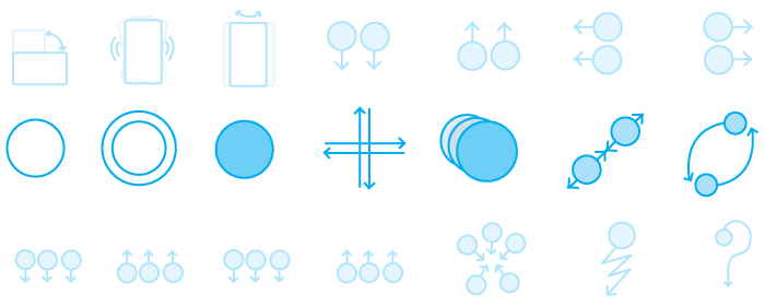
The icons are consistently built upon a logic semantic principle:
- CIRCLE == TOUCH
- GREY COLOR == LONG PRESS
- ARROWS == PATH TO FOLLOW
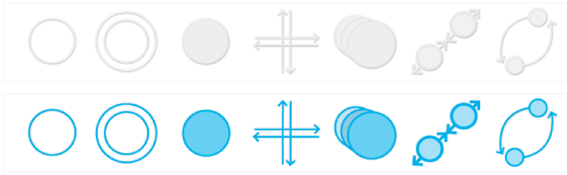
The seven icons represents respectively:
- Tap: with a circle that represents a touch.
- Double Tap: with two circles that represents the two touches.
- Touch and Hold: with a circle with the inner grey part that that indicates a long press touch.
- Swipe: four arrows pointing on the four directions that allow the user to accomplish a swipe gesture, along the vertical or horizontal direction. The icon doesn’t contain circles because the gesture doesn’t require long presses and most important can be initiated from any place, not neces- sary from the centre.
- Drag: three circles with different grey saturations (lighter behind, heavier in front) that shows that the object can be moved with a touch and drag.
- Pinch: two circles that indicate that the gesture requires two fingers and the arrows that show the two fingers can be moved together towards outside or towards the centre.
- Rotate: two circles indicating that the gesture requires two fingers and the arrow those outline the circular path that the fingers have to follow to correctly accomplish the gesture.
Triple Tap Gesture
Six users mentioned that they find slower the triple tap. Possible causes are: from one side, that the touch and hold gesture is a basic gesture, users are more familiar with it, therefore they are more forgiving toward this gesture; After the triple tap gesture is required an extra tap to select the target item. Therefore, with a user test I measured the time spent with the triple tap (avg. 0.4s), and I probed that there is not a big difference with the touch and hold (0.5s). I merged two previously distinct actions (when the user triple taps the item under the last touch is selected), therefore there are not extra tap required.
I chose to keep the triple tap gesture as the only gesture used for activating and deactivating the gesture hinting mode. The improvement makes faster the interaction, for the selection of the first target item, and thus reduces the effort and the time spent by the users.
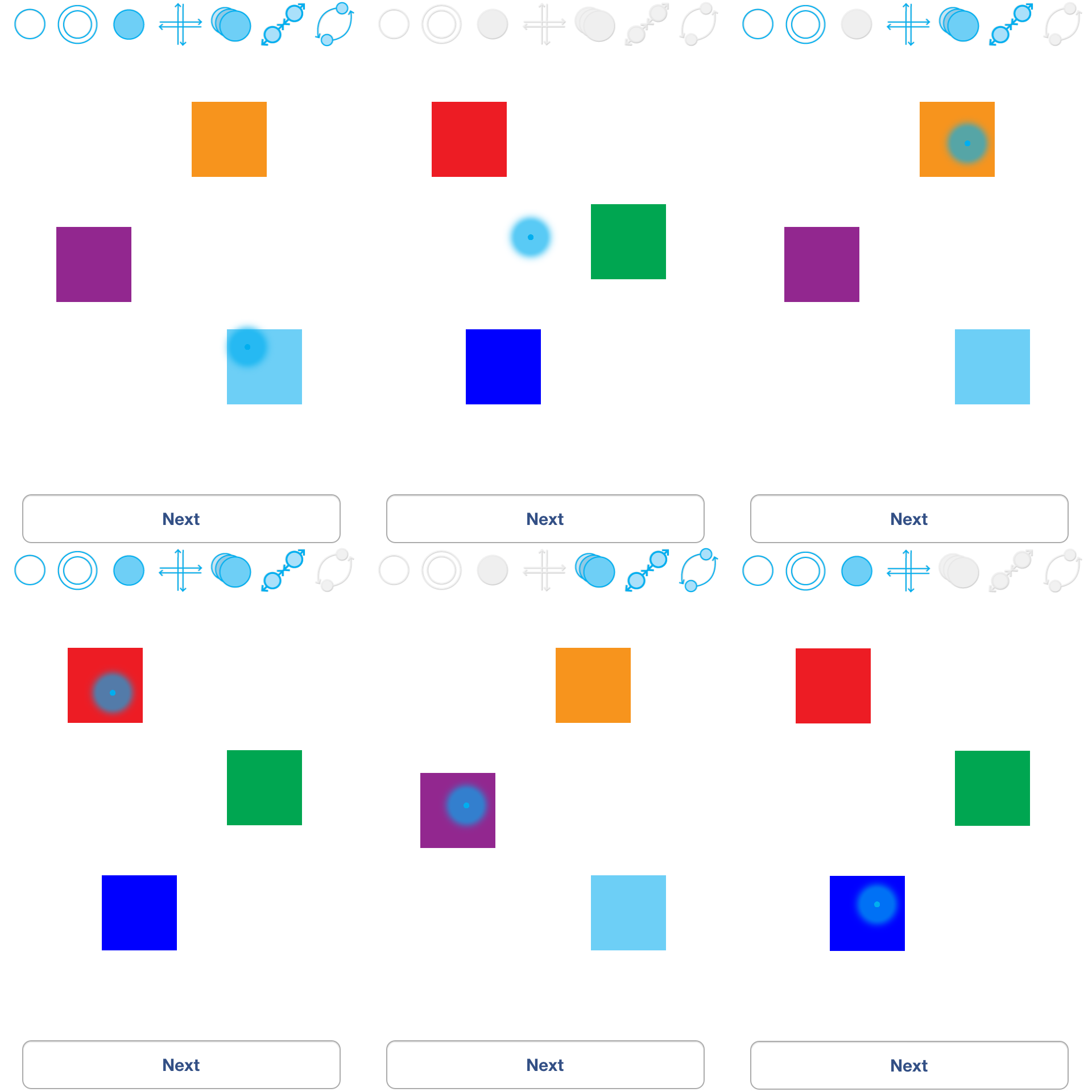
Last Touch Marker
Eventually, the marker is represented with a semi-transparent amorphous shape, designed with a radial gradient centered on a small dot that follows everywhere the touches of the finger on the screen and shows the exactly point where the touches ended. In this way the user has always the focus on the last target item and knows clearly and easily to which element of the interface the available gestures highlighted in the top bar are referring to.

The last touch marker is design in such a way that is well visible on different kind of backgrounds. Since the radial gradient contrast with the full centered small dot, the luminance and contrast make the marker always visible. In the following picture are presented different background colours where the marker is displayed.
Minor Technical Decisions
Finally I considered three minor technical issues: the top bar appearance, a fade in animation for the activation of the gesture hinting mode and the position of the top bar in landscape orientation.
Top Bar Appearance
I chose the semi-transparent glassy background for two reasons. The first is that the semi-transparency leaves partially visible the background and thus gives a sort of context to the user; while with the white background the top bar seems to cut the underlying interface. The second reason is that since I implemented the prototype for iOS, and this solution recalls the background used for the control panel introduced in iOS 7.
Fade in Animation
I implemented and tested two prototypes to see the difference between these options: the first was without any animation; the second one slide the top bar down to reveal it and slide it up to hide it. The animation was programmatically designed for having a duration of 0.3 seconds. Besides these weak motivations I would say that both solutions are good. I chose to implement the one without the animation because is quicker.
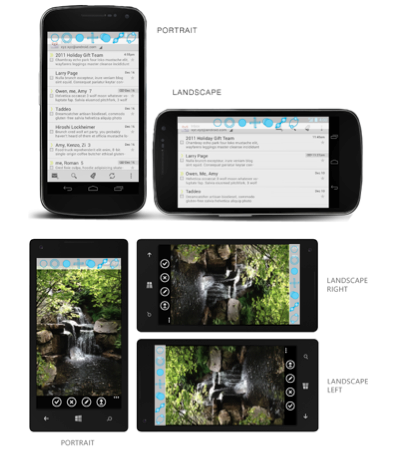
Landscape Orientation
For iOS and Android I suggest using the top bar always on the top of the screen. When the orientation of the device changes the width of the display increase, the top bar shouldn't be resized, and neither stretched. When the orientation changes the top bar is centered in the top of the screen; therefore it occupies always 320 x 44 pixels in the top centre of the screen. For Windows Phone I suggest moving the top bar on the same side where the status bar is moved. The icons in the top bar can be rotated and displayed vertically one under the other; there are no problems to change the orientation of the icons because they were designed in square areas that occupy the same amount of pixels.